You're reading for free via Ali's Friend Link. Become a member to access the best of Medium.
Member-only story
A Structured Guide For Plotting With Matplotlib
Learn to create data visualization from raw numbers in this article

Data visualization is crucial in the domain of machine learning and data science. It allows you to uncover data patterns and, and give you insights that numbers can’t.
It is impossible to comprehend raw numbers when the dataset reaches millions.
This is where matplotlib comes in, with its visualization, you can find patterns in data, within no time. You will have the power to convert eye-pricking raw numbers into beautiful-looking images.
When doing machine learning, it is impossible to ignore matplotlib. With it, you do data exploration, which gives you insights and patterns into your data. With the newly found patterns, you can do feature selection and engineering.
Today, I will equip you with the groundwork to start using Matplotlib confidently. Firstly I will go over the structure of Matplotlib, and give you a bird eye view. Then introduce you to plots and functions you will need in the future, all with code and results.
After reading this blog, you will be an expert at Matplotlib.
So without wasting much time, let us dive into the realm of Matplotlib.
Matplotlib breakdown
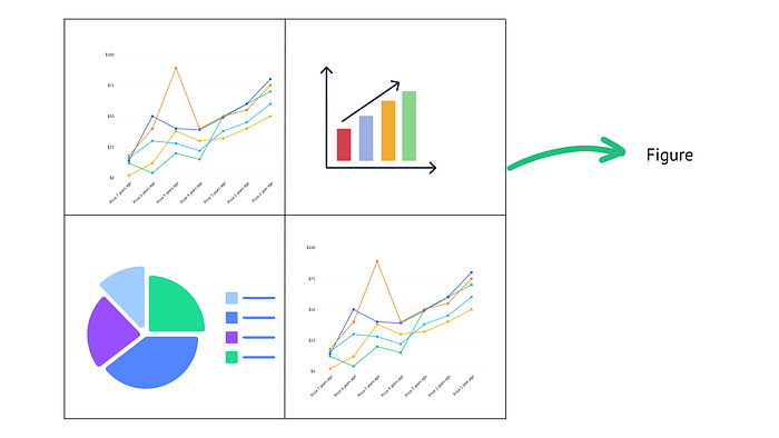
Figure
A figure is a container that holds all the elements of the plot.
It can be thought of as a canvas that will hold all the elements of your visualization. The four plots you see in this picture are all part of one figure.
Axes:
Axes are the individual plots within the figure.
You can control all the attributes of axes. A figure can have multiple axes arranged in a grid-like structure.
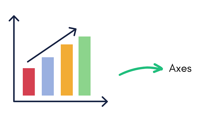
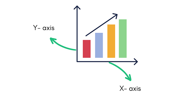
Axis:
Axis is the x-axis or the y-axis of the plot. It represents the scale and labels of your plot.
Title:
Displayed at the top of your figure, the title is a text element that provides a descriptive title for the plot.
Labels:
Labels provide you context and descriptive names for your x-axis and y-axis.
Legends:
Used to identify the different elements in the figure. They provide labels and explanations.
Plotting your first figure
1. Importing the library:
In Jupyter Notebook, start by importing the matplotlib library.
import matplotlib.pyplot as plt2. Creating a figure and axes:
You can potentially specify parameters like the figure size and resolution.
fig = plt.figure()Once you have a figure, you can create one or more subplots called axes within it.
To create an axes, you can use the fig.add_subplot() method or the plt.subplots() function.
If you are wondering what that 1,1,1 means, keep reading, I will explain later in this story.
ax = fig.add_subplot(1, 1, 1) # creates a single subplot3. Plotting data:
After creating axes, you can plot data on it using various plotting functions provided by Matplotlib.
Matplolib provides you with an extensive library of different kinds of plots. I will be showing you the most popular ones, with code.
.plot displays a simple line plot
x = [1, 2, 3, 4, 5]
y = [2, 4, 6, 8, 10]
ax.plot(x, y)  # line plot
4. Customizing the plot:
You have tons of options to customize your plot. You can set labels, titles, axis limits, markers, colors, line styles, and more.
To customize your plot, you first access the .ax object and use the various methods as per your needs.
Here we will customize the title and labels.
ax.set_xlabel('X-axis')
ax.set_ylabel('Y-axis')
ax.set_title('My Plot')
ax.set_xlim(0, 6)
ax.set_ylim(0, 12)
5. Displaying or saving the plot:
Once done, you can display it using the plt.show() function, which opens a window showing the plot.
Alternatively, you can save the plot to a file using the plt.savefig() function.
plt.show()  # display the plot
plt.savefig('my_plot.png')  # save the plot to a file
Here is the final code and the result.
fig = plt.figure()
ax = fig.add_subplot(1, 1, 1)  # creates a single subplot
x = [1, 2, 3, 4, 5]
y = [2, 4, 6, 8, 10]
ax.set_xlabel('Area (sqm)')
ax.set_ylabel('Price($)')
ax.set_title('House Price')

ax.plot(x, y)  # line plot
plt.show()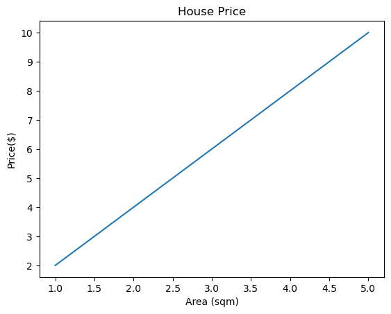
Important Plots and Functions in Matplotlib
1. Line Plots:
plot(): Creates a line plot with x and y values.
import matplotlib.pyplot as plt

# Data for the x-axis (time) and y-axis (temperature)
time = [1, 2, 3, 4, 5, 6, 7, 8, 9, 10]
temperature = [25, 26, 28, 30, 29, 27, 26, 28, 30, 31]

# Plotting the data (here the plot() function is used)
plt.plot(time, temperature)

# Adding labels and title
plt.xlabel('Time')
plt.ylabel('Temperature')
plt.title('Temperature Changes')

# Displaying the plot
plt.show()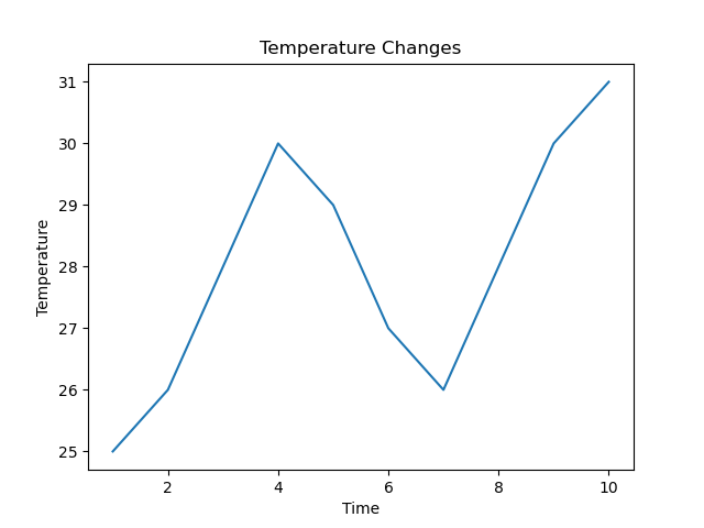
2. Scatter Plots:
scatter(): Generates a scatter plot with individual data points.
# Data for the x-axis and y-axis
x = [1, 2, 3, 4, 5]
y = [3, 5, 2, 7, 4]

# Creating the scatter plot
plt.scatter(x, y)

# Adding labels and title
plt.xlabel('X')
plt.ylabel('Y')
plt.title('Scatter Plot')

# Displaying the plot
plt.show()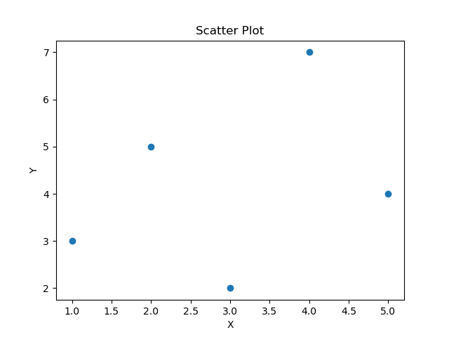
hexbin(): Plots hexagonal binning for visualizing data density.
import matplotlib.pyplot as plt
import numpy as np

# Generating random data
np.random.seed(42)
x = np.random.randn(5000)
y = np.random.randn(5000)

# Creating the hexbin plot
plt.hexbin(x, y, gridsize=20, cmap='Blues')

# Adding a colorbar
plt.colorbar()

# Adding labels and title
plt.xlabel('X')
plt.ylabel('Y')
plt.title('Hexbin Plot')

# Displaying the plot
plt.show()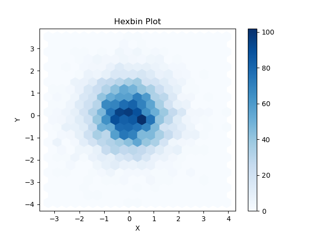
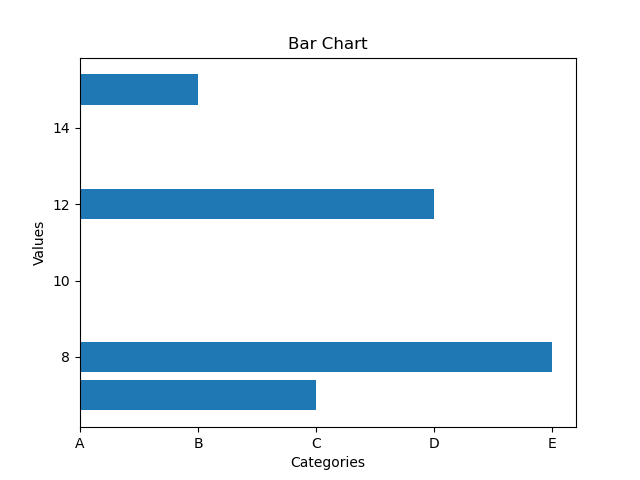
3. Bar Plots:
bar(): Produces vertical bar plots.
# Data for the x-axis (categories) and y-axis (values)
categories = ['A', 'B', 'C', 'D', 'E']
values = [10, 15, 7, 12, 8]

# Creating the bar chart
plt.bar(categories, values)

# Adding labels and title
plt.xlabel('Categories')
plt.ylabel('Values')
plt.title('Bar Chart')

# Displaying the plot
plt.show()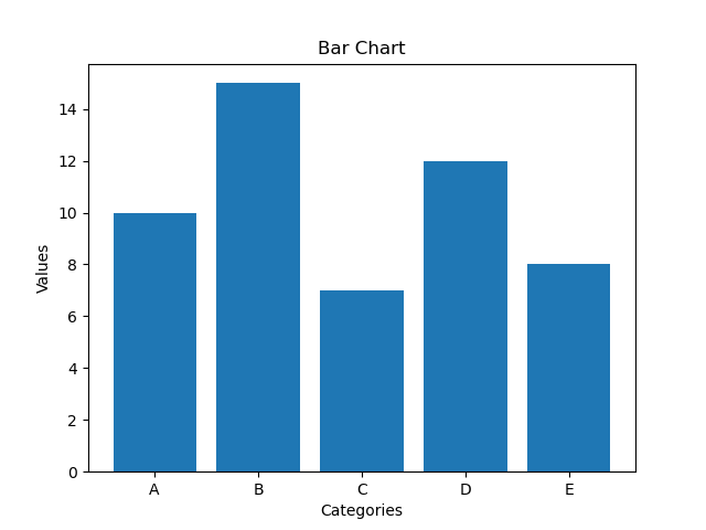
barh(): Generates horizontal bar plots.
4. Histograms:
hist(): Creates histograms, which show the distribution of a dataset.
import matplotlib.pyplot as plt
import numpy as np

# Generating random data
np.random.seed(42)
data = np.random.randn(1000)

# Creating the histogram
plt.hist(data, bins=30, edgecolor='black')

# Adding labels and title
plt.xlabel('Values')
plt.ylabel('Frequency')
plt.title('Histogram')

# Displaying the plot
plt.show()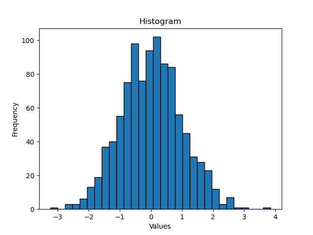
5. Pie Charts:
pie(): Creates a pie chart, which displays the proportions of a whole dataset.
# Data for the pie chart
sizes = [30, 15, 25, 10, 20]  # Sizes of each pie slice
labels = ['Slice 1', 'Slice 2', 'Slice 3', 'Slice 4', 'Slice 5']  # Labels for each slice
explode = [0, 0, 0.1, 0, 0]  # Explode values (offset slices)

# Creating the pie chart
plt.pie(sizes, labels=labels, explode=explode, autopct='%1.1f%%', shadow=True)

# Adding a title
plt.title('Pie Chart')

# Displaying the plot
plt.show()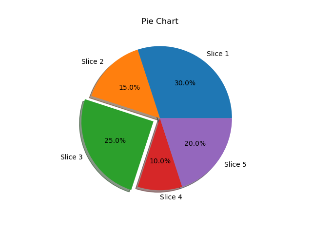
6. Box Plots:
boxplot(): Creates box and whisker plots to visualize the distribution of a dataset.
import matplotlib.pyplot as plt
import numpy as np

# Generating random data for three groups
np.random.seed(42)
data1 = np.random.normal(0, 1, 100)
data2 = np.random.normal(2, 1, 100)
data3 = np.random.normal(-2, 1, 100)

# Combining the data into a list
data = [data1, data2, data3]

# Creating the box plot
plt.boxplot(data)

# Adding labels and title
plt.xlabel('Groups')
plt.ylabel('Values')
plt.title('Box Plot')

# Displaying the plot
plt.show()
7. Heatmaps:
imshow(): Displays a 2D array as a heatmap.
import matplotlib.pyplot as plt
import numpy as np

# Generating random data for the heatmap
np.random.seed(42)
data = np.random.rand(5, 5)  # 5x5 grid of random values

# Creating the heatmap
plt.imshow(data, cmap='hot')

# Adding colorbar
plt.colorbar()

# Adding labels and title
plt.xlabel('X-axis')
plt.ylabel('Y-axis')
plt.title('Heatmap')

# Displaying the plot
plt.show()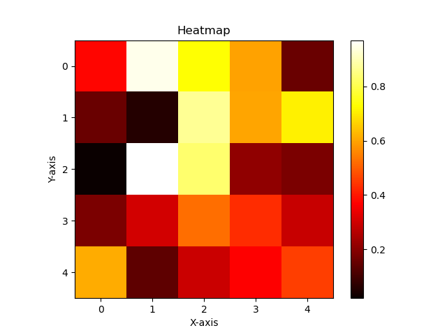
pcolor(): Generates a pseudocolor plot.
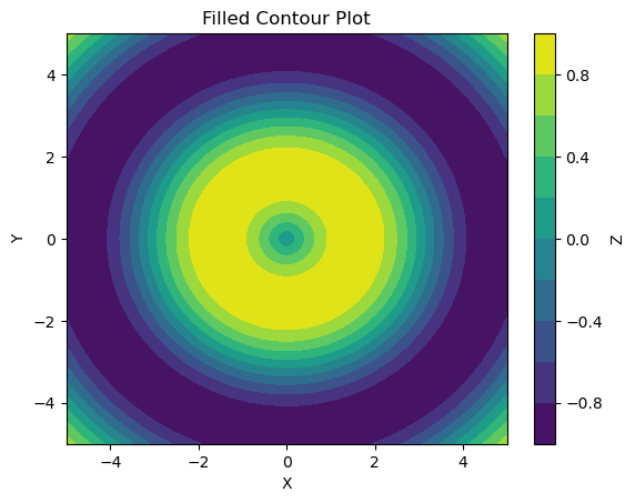
8. Contour
contour() : They are used for 2D representations of 3D data.
# Generating data for the contour plot
x = np.linspace(-5, 5, 100)
y = np.linspace(-5, 5, 100)
X, Y = np.meshgrid(x, y)
Z = np.sin(np.sqrt(X**2 + Y**2))

# Creating the contour plot
plt.contour(X, Y, Z, cmap='viridis')

# Adding colorbar
plt.colorbar()

# Adding labels and title
plt.xlabel('X-axis')
plt.ylabel('Y-axis')
plt.title('Contour Plot')

# Displaying the plot
plt.show()
contourf(): Generates contour plots to visualize 2D data with continuous or filled contours, respectively.
9. Violinplot
violinplot(): Generates violin plots, which combine box plots with kernel density estimations, providing more detailed information about data distribution.
np.random.seed(42)
data1 = np.random.normal(0, 1, 100)
data2 = np.random.normal(2, 1, 100)
data3 = np.random.normal(-2, 1, 100)

# Combining the data into a list
data = [data1, data2, data3]

# Creating the violin plot
plt.violinplot(data)

# Adding labels and title
plt.xlabel('Groups')
plt.ylabel('Values')
plt.title('Violin Plot')

# Displaying the plot
plt.show()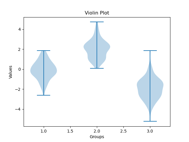
10. 3D Plots:
plot_surface(): Creates a surface plot in 3D.
# Generating data for the surface plot
x = np.linspace(-5, 5, 100)
y = np.linspace(-5, 5, 100)
X, Y = np.meshgrid(x, y)
Z = np.sin(np.sqrt(X**2 + Y**2))

# Creating the surface plot
fig = plt.figure()
ax = fig.add_subplot(111, projection='3d')
ax.plot_surface(X, Y, Z, cmap='viridis')

# Adding labels and title
ax.set_xlabel('X-axis')
ax.set_ylabel('Y-axis')
ax.set_zlabel('Z-axis')
ax.set_title('Surface Plot')

# Displaying the plot
plt.show()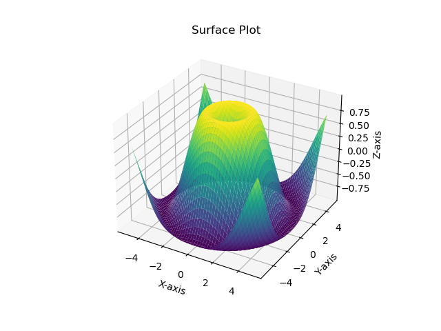
scatter3D(): Generates a scatter plot in 3D.
# Generating random data for the 3D scatter plot
np.random.seed(42)
n_points = 100
x = np.random.rand(n_points)
y = np.random.rand(n_points)
z = np.random.rand(n_points)
colors = np.random.rand(n_points)
sizes = 100 * np.random.rand(n_points)

# Creating the 3D scatter plot
fig = plt.figure()
ax = fig.add_subplot(111, projection='3d')
ax.scatter3D(x, y, z, c=colors, s=sizes, cmap='viridis')

# Adding labels and title
ax.set_xlabel('X-axis')
ax.set_ylabel('Y-axis')
ax.set_zlabel('Z-axis')
ax.set_title('3D Scatter Plot')

# Displaying the plot
plt.show()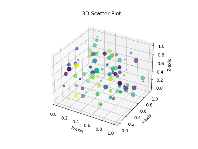
11. Managing Layout:
1. Subplot()
subplot(): Creates subplots within a grid.- This function allows you to create a single subplot within a grid-like structure.
- It takes three arguments: the total number of rows, the total number of columns, and the index of the current subplot. The index starts from 1 and increases from left to right and top to bottom.
# Creating a 2x2 grid of subplots
plt.subplot(2, 2, 1)
plt.plot([1, 2, 3, 4])

plt.subplot(2, 2, 2)
plt.plot([4, 3, 2, 1])

plt.subplot(2, 1, 2)
plt.plot([1, 3, 2, 4])

# Displaying the subplots
plt.show()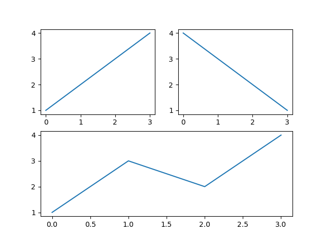
2. Subplots()
subplots(): Creates multiple subplots.- This function allows you to create a grid of subplots as an array of
Axesobjects. - It returns both the figure and an array of axes. The number of rows and columns is specified as arguments.
# Creating a 2x2 grid of subplots
fig, axs = plt.subplots(2, 2)

axs[0, 0].plot([1, 2, 3, 4])
axs[0, 1].plot([4, 3, 2, 1])
axs[1, 0].plot([1, 3, 2, 4])

# Displaying the subplots
plt.show()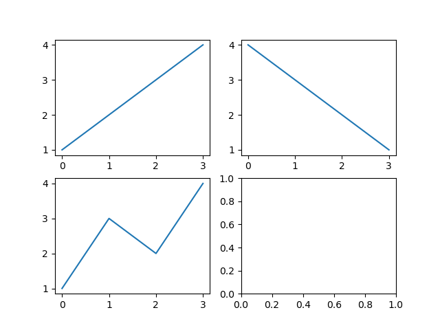
tight_layout(): Adjusts the spacing between subplots.
12. Annotations and Labels:
annotate(): Adds annotations to the plot, including text with arrows or markers, making it easier to highlight specific data points or features.
# Creating a scatter plot
x = [1, 2, 3, 4, 5]
y = [2, 4, 6, 8, 10]
plt.scatter(x, y)

# Adding annotations
plt.annotate('Point A', xy=(2, 4), xytext=(3, 6),
             arrowprops=dict(arrowstyle='->'))

plt.annotate('Point B', xy=(4, 8), xytext=(4.5, 9),
             arrowprops=dict(arrowstyle='->'))

# Displaying the plot
plt.show()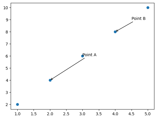
text(): Adds text annotations to a plot.xlabel(),ylabel(): Sets labels for the x and y axes.title(): Sets the title of the plot.xticks(),yticks(): Allows customization of tick locations and labels along the x-axis and y-axis.
# Generating data
x = np.linspace(0, 10, 100)
y = np.sin(x)

# Creating a plot
plt.plot(x, y)

# Customizing y-axis ticks
plt.yticks([-1, 0, 1], ['Min', 'Mid', 'Max'])

# Displaying the plot
plt.show()
13. Legends and Colorbars:
legend(): Adds a legend to the plot.colorbar(): Adds a colorbar to a plot with a colormap plot.
14. Customizing Plots
xlim(),ylim(): Sets the limits or range of values displayed on the x-axis and y-axis, respectively.grid(): Displays gridlines on the plot, aiding in visual alignment and reference.
Conclusion
In this article, we went through the main components of matplotlib, and the various plots at your disposal. And then, we looked at the major methods you can use to customize your plots. I hope it was a lovely journey.
Thank you for reading till the end, if you would like to add your favorite methods that I might have missed and want to help others reading this, please feel welcome.
I look forward to your feedback. Until I write again…